By Mile High Home Group
Choosing paint colors seems simple, until you're staring at dozens of swatches under Denver’s bright afternoon light, wondering why “greige” suddenly looks purple. We’ve helped countless clients stage and refresh their homes, and we’ve seen firsthand how the right paint color can completely change the feel of a space. Whether you're selling, settling in, or just looking for a fresh look, here's what you need to know about choosing colors that feel intentional, balanced, and tailored to your space.
Key Takeaways
-
Use color psychology to match tones to each room’s purpose
-
Denver’s natural light and seasons affect how colors appear
-
Test paint samples in your own space before committing
-
Neutral doesn’t mean boring—undertones and finishes matter
Start with the Room’s Purpose and Mood
Color sets the emotional tone for a space. Before picking a shade, think about how you want the room to feel.
Matching Color to Function
-
Living rooms: warm neutrals or soft blues to encourage gathering and calm
-
Bedrooms: muted tones like sage, dusty rose, or pale gray for relaxation
-
Kitchens: whites, creamy tones, or cool greens for energy and cleanliness
-
Home offices: blues or soft greens to boost focus and clarity
-
Dining rooms: bold earth tones or charcoal for sophistication and appetite appeal
Understanding color psychology helps you choose with purpose instead of just picking what’s trendy.
Factor in Denver’s Unique Light Conditions
Our Mile High elevation means brighter light and more sunshine, which changes how paint reads in real life.
What Denver Light Does to Color
-
South-facing rooms: get intense light—cool colors can balance the warmth
-
North-facing rooms: receive cooler light—warm tones add coziness
-
Rooms with lots of windows: colors will appear more vibrant
-
Low-light spaces: use lighter, reflective shades to brighten the feel
We always suggest testing paint swatches in the actual room, at different times of day, to see how they perform.
Use the 60-30-10 Rule for Balance
A timeless design principle, the 60-30-10 rule helps guide how much of each color to use in a space.
How It Works
-
60%: your dominant color—usually walls or large furniture
-
30%: secondary color—accent walls, textiles, or cabinetry
-
10%: accent color—art, pillows, trim, or décor pieces
This method keeps your space feeling layered and intentional without being overwhelming.
Consider Undertones and Color Temperatures
Two beiges are rarely the same. Undertones (warm, cool, or neutral) can make or break your color scheme, especially when working with fixed features like flooring or countertops.
Color Temperature Guidelines
-
Warm colors: reds, yellows, and warm taupes are cozy and inviting
-
Cool colors: blues, greens, and grays are calming and clean
-
Neutral undertones: versatile, especially for open floor plans
We recommend pairing paint with existing finishes to avoid clashing undertones, which is something we always help clients identify during staging consultations.
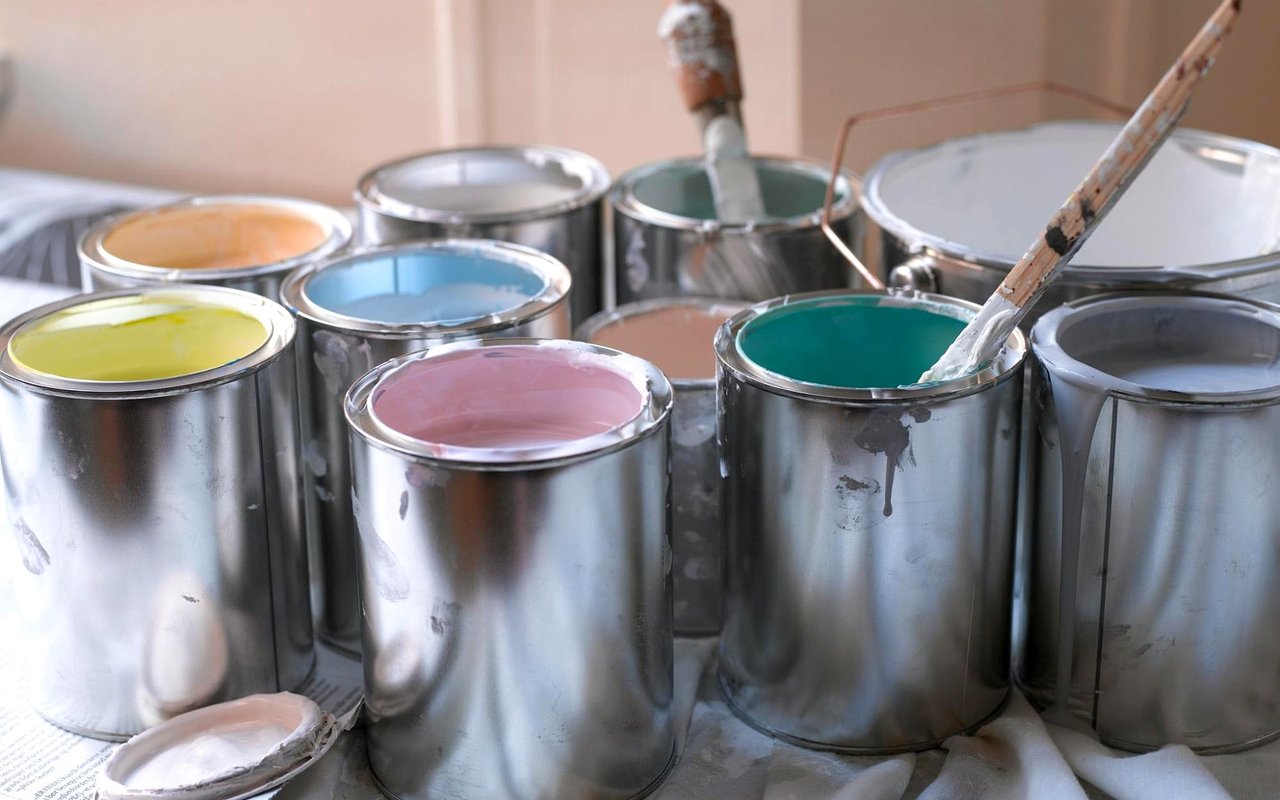
Test Samples the Right Way
Never skip this step; it’s the best way to avoid color regret. Denver’s bright skies can dramatically alter how colors appear indoors.
Tips for Smart Sampling
-
Use large swatches or sample boards, not just small patches
-
View samples in morning, midday, and evening light
-
Test on multiple walls, especially near windows and corners
-
Wait for the paint to dry fully before making your final call
Some shades will surprise you; what looks great under store lighting might feel completely different at home.
Don't Overlook the Finish
Finish affects how a color looks and performs. Choose the right sheen for both appearance and practicality.
Finish Options by Room
-
Flat/matte: best for ceilings or low-traffic areas
-
Eggshell/satin: ideal for living rooms, bedrooms, and hallways
-
Semi-gloss: great for kitchens, bathrooms, and trim (easy to clean)
-
High-gloss: bold and dramatic, but best used sparingly
In Denver, where homes often blend indoor and outdoor elements, a satin finish provides the right mix of durability and elegance for most interiors.
FAQs
What’s the most versatile paint color for resale in Denver?
Soft greige or warm whites are great for broad appeal. They complement most styles and help buyers envision the space as their own.
Can I use bold colors in small rooms?
Absolutely, but balance is key. Try an accent wall or use bold colors in powder rooms, offices, or dining spaces where drama works well.
Should I repaint before listing my home?
In most cases, yes. A fresh coat of paint is one of the most cost-effective ways to boost appeal and show your home at its best.
Contact Mile High Home Group Today
At Mile High Home Group, we help Denver homeowners make smart, stylish choices that add value and feel great to live in. From full home refreshes to getting your space ready to list, we guide clients on how to choose colors for a room that reflect their goals and work with the unique character of each property.
Reach out to us at Mile High Home Group, and let’s talk about how a few well-chosen paint tones can completely transform the feel (and future) of your home.
Reach out to us at Mile High Home Group, and let’s talk about how a few well-chosen paint tones can completely transform the feel (and future) of your home.